Bottom tabs
Let's add a bottom tabs navigator with two tabs.
With Expo Router, every file in the app folder is a screen for your app, and the _layout files describe how the app should be laid out.
Add a second screen
Add profile screen:
New file: app/profile.tsx
import { Text, View, StyleSheet } from "react-native";

export default function ProfileScreen() {
  return (
    <View style={styles.container}>
      <Text style={styles.text}>Profile</Text>
    </View>
  );
}

const styles = StyleSheet.create({
  container: {
    flex: 1,
    justifyContent: "center",
    alignItems: "center",
    backgroundColor: "#fff",
  },
  text: {
    fontSize: 24,
  },
});
Two-tab layout
Now we'll want to update the layout file to list the second screen and render as Tabs instead of a Stack:
Update: app/_layout.tsx
@@ -1,9 +1,10 @@
-import { Stack } from "expo-router";
+import { Tabs } from "expo-router";

 export default function Layout() {
   return (
-    <Stack>
-      <Stack.Screen name="index" options={{ title: "Home" }} />
-    </Stack>
+    <Tabs>
+      <Tabs.Screen name="index" options={{ title: "Home" }} />
+      <Tabs.Screen name="profile" options={{ title: "Profile" }} />
+    </Tabs>
   );
 }
Bottom tabs icons
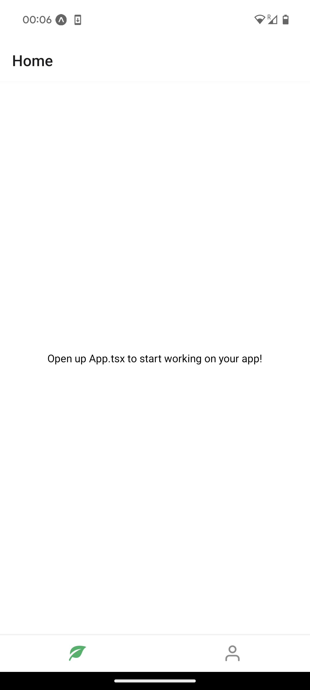
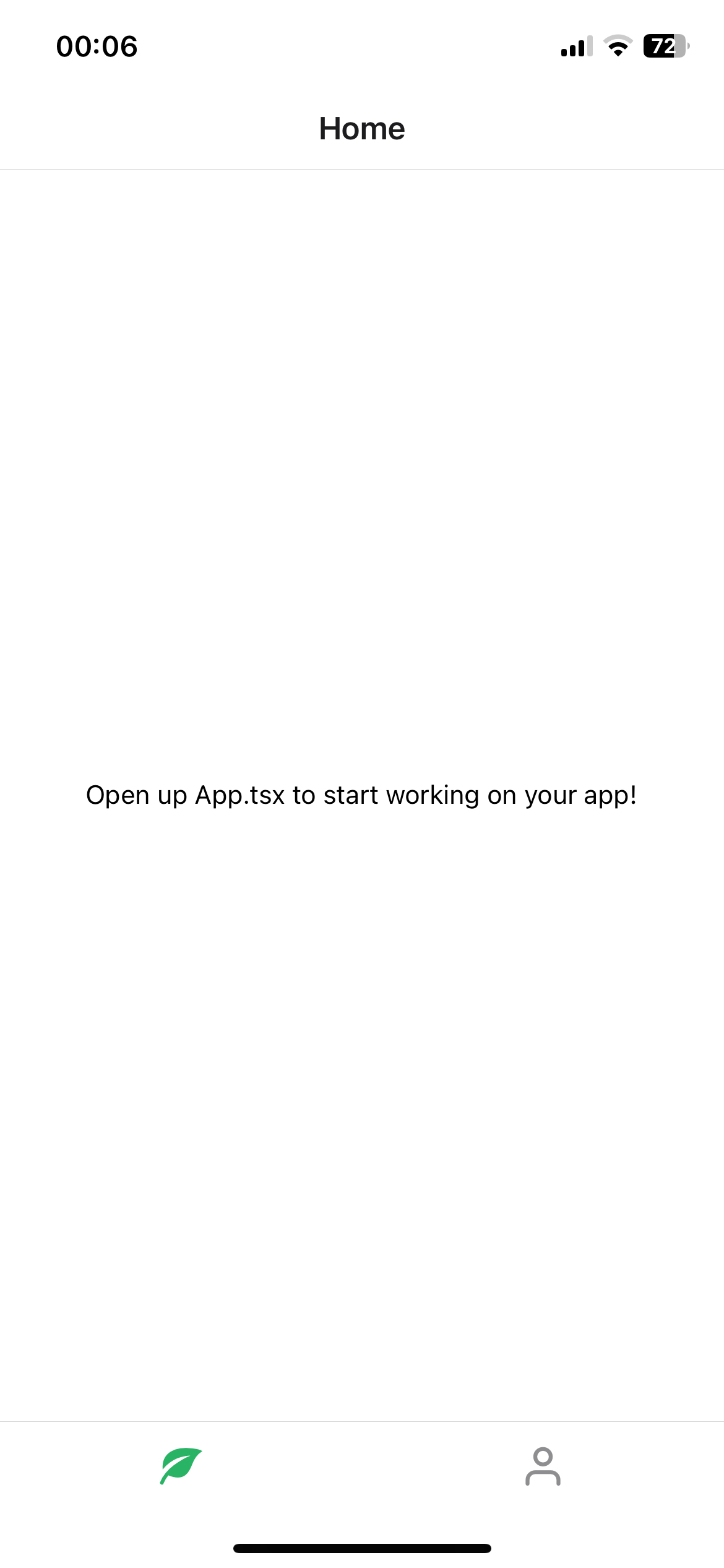
We'll want to add some icons for our tabs. These can be any React component, so you can bring your own images SVGs etc. For this app, we'll use @expo/vector-icons.
Install the expo vector icons library:
npx expo install @expo/vector-icons
You can browse the available icons here and choose what you like (I chose this leaf and this user icon). We'll also pass in #29b365 as the active tint color for all the tab icons.
Update: app/_layout.tsx
@@ -1,10 +1,31 @@
 import { Tabs } from "expo-router";
+import Entypo from "@expo/vector-icons/Entypo";
+import Feather from "@expo/vector-icons/Feather";
+import { theme } from "../theme";

 export default function Layout() {
   return (
-    <Tabs>
-      <Tabs.Screen name="index" options={{ title: "Home" }} />
-      <Tabs.Screen name="profile" options={{ title: "Profile" }} />
+    <Tabs screenOptions={{ tabBarActiveTintColor: theme.colorGreen }}>
+      <Tabs.Screen
+        name="index"
+        options={{
+          title: "Home",
+          tabBarShowLabel: false,
+          tabBarIcon: ({ size, color }) => (
+            <Entypo name="leaf" size={size} color={color} />
+          ),
+        }}
+      />
+      <Tabs.Screen
+        name="profile"
+        options={{
+          title: "Profile",
+          tabBarShowLabel: false,
+          tabBarIcon: ({ size, color }) => (
+            <Feather name="user" size={size} color={color} />
+          ),
+        }}
+      />
     </Tabs>
   );
 }
Add a theme file (optional)
When using StyleSheet for styling, it's a good practice to define a theme file to avoid duplicating primitives like colors.
New file: theme.ts
export const theme = {
  colorGreen: "#29b365",
  colorWhite: "#fff",
};
Update: app/_layout.tsx
@@ -1,10 +1,11 @@
 import { Tabs } from "expo-router";
 import Entypo from "@expo/vector-icons/Entypo";
 import Feather from "@expo/vector-icons/Feather";
+import { theme } from "../theme";

 export default function Layout() {
   return (
-    <Tabs screenOptions={{ tabBarActiveTintColor: "#29b365" }}>
+    <Tabs screenOptions={{ tabBarActiveTintColor: theme.colorGreen }}>
       <Tabs.Screen
         name="index"
         options={{
Update: app/profile.tsx
@@ -1,4 +1,5 @@
 import { Text, View, StyleSheet } from "react-native";
+import { theme } from "../theme";

 export default function ProfileScreen() {
   return (
@@ -13,7 +14,7 @@ const styles = StyleSheet.create({
     flex: 1,
     justifyContent: "center",
     alignItems: "center",
-    backgroundColor: "#fff",
+    backgroundColor: theme.colorWhite,
   },
   text: {
     fontSize: 24,
Update: app/index.tsx
@@ -1,5 +1,6 @@
 import { StatusBar } from "expo-status-bar";
 import { StyleSheet, Text, View } from "react-native";
+import { theme } from "../theme";

 export default function App() {
   return (
@@ -13,7 +14,7 @@ export default function App() {
 const styles = StyleSheet.create({
   container: {
     flex: 1,
-    backgroundColor: "#fff",
+    backgroundColor: theme.colorWhite,
     alignItems: "center",
     justifyContent: "center",
   },
Hide the tab bar text
In this case, I think the tab bar icons are enough to communicate what each screen is about so let's hide the tab bar label and keep it icon-only.
Update: app/_layout.tsx
@@ -10,6 +10,7 @@ export default function Layout() {
         name="index"
         options={{
           title: "Home",
+          tabBarShowLabel: false,
           tabBarIcon: ({ color, size }) => (
             <Entypo name="leaf" size={size} color={color} />
           ),
@@ -19,6 +20,7 @@ export default function Layout() {
         name="profile"
         options={{
           title: "Profile",
+          tabBarShowLabel: false,
           tabBarIcon: ({ color, size }) => (
             <Feather name="user" size={size} color={color} />
           ),
Checkpoint
| Android | iOS |
|---|---|
 |  |