Local Images
There are two ways to add images to your app - you can either include them in your app bundle, or load them via a url. Local images are the ones included in the app bundle.
First, let's create an /assets folder inside your project's /src directory. This is a place to keep all your non-code files (images, icons, fonts etc).
Right click -> "Save Image As", and save the image in your /assets folder (Image from FlatIcon).

Open MoodPicker.tsx and at the top of the file, add a constant for the image source. In React Native, you need to use require to get the path for a local image.
const imageSrc = require('../../assets/butterflies.png');
<Image source={imageSrc} />;And voila, you have rendered an image!
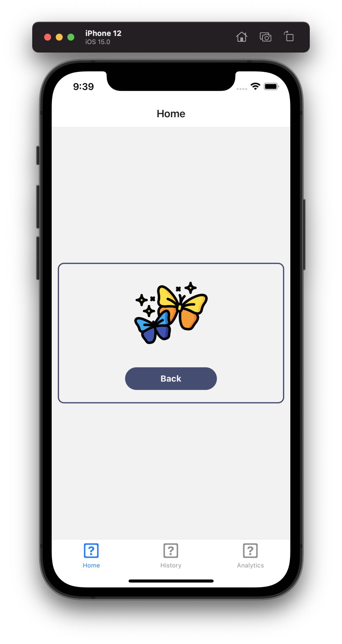
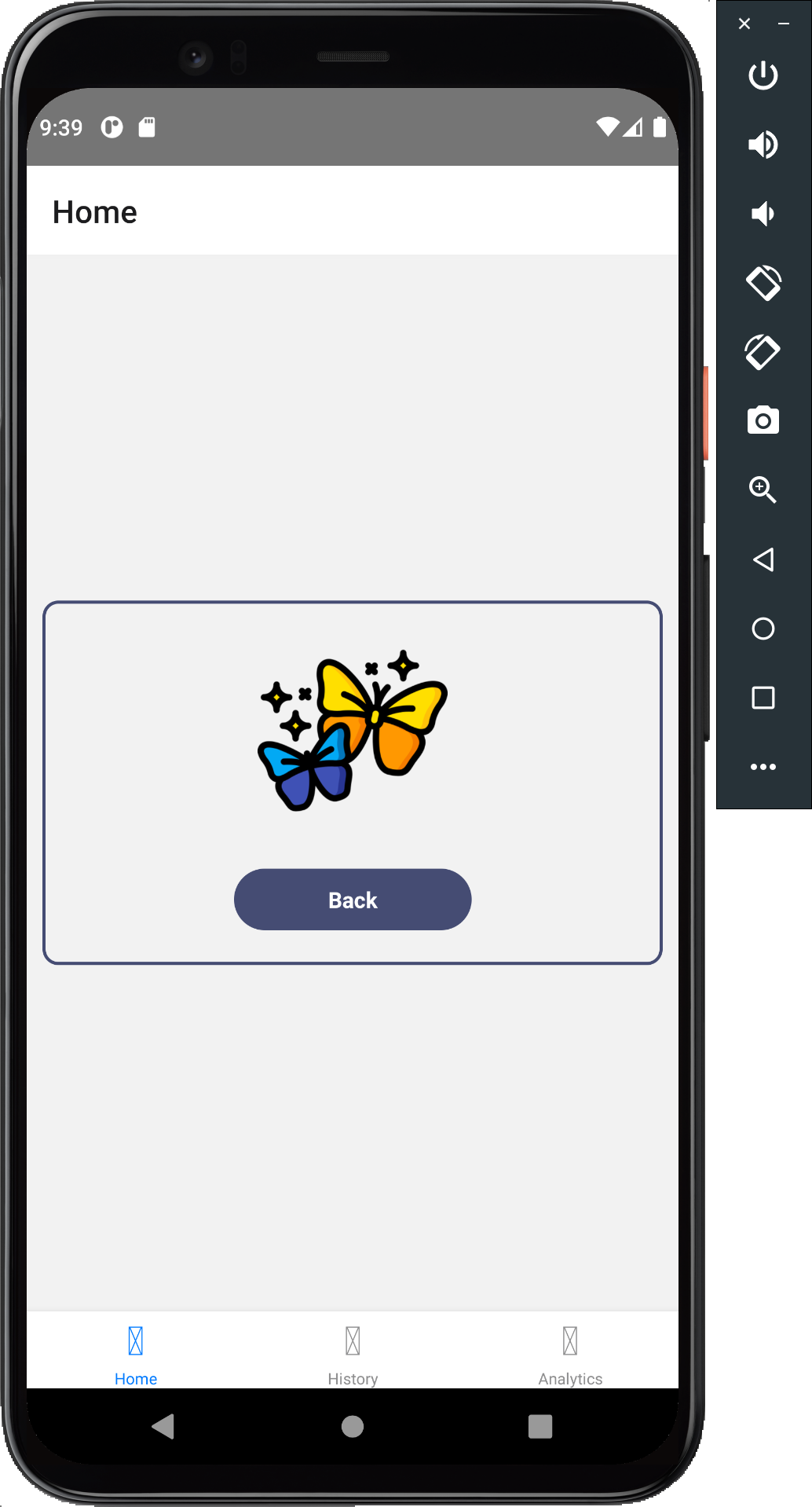
Let's add a thank you page for then the user has selected a mood, and a call to action for "choose another mood":
export const MoodPicker: React.FC<MoodPickerProps> = ({ onSelect }) => {  const [selectedMood, setSelectedMood] = React.useState<MoodOptionType>();+  const [hasSelected, setHasSelected] = React.useState(false);  const handleSelect = React.useCallback(() => {    if (selectedMood) {      onSelect(selectedMood);      setSelectedMood(undefined);+      setHasSelected(true);    }  }, [onSelect, selectedMood]);
+  if (hasSelected) {+    return (+      <View style={styles.container}>+        <Image source={imageSrc} style={styles.image} />+        <Pressable style={styles.button} onPress={() => setHasSelected(false)}>+          <Text style={styles.buttonText}>Back</Text>+        </Pressable>+      </View>+    );+  }
  return (    <View style={styles.container}>      <Text style={styles.heading}>How are you right now?</Text>
Let's give the container a fixed height to ensure it doesn't change size between selections, and let's add a style for the image to center it within the container:
container: { borderWidth: 2, borderColor: theme.colorPurple, margin: 10, borderRadius: 10, padding: 20,+ justifyContent: 'space-between',+ height: 230,},+image: {+ alignSelf: 'center',+},Adapting to Screen Sizes#
You would have noticed that when doing styling in React Native, we don't really use "pixels" or "ems" or "rems", but just "display points". This is because the "points" are relative depending on the screen size.
The pixel density of a screen denotes how many pixels a screen has per a inch or cm. What it comes down to is this: width: 10 in React Native is not the same as width: "10px" on the web. It actually means width: (10 * pixel_density)px.
An increased pixel density makes the displays looks more crisp and smooth, which is why the "retina displays" for mac and iPhone look so good. For a retina display, the pixel density is 3x a regular display. This makes for a wonderful user experience, but as developers, we will need to ensure that our image assets are large enough to support this high resolution. So e.g. if we wanted to display a 100x100 image on a retina display then really to make it as crisp as possible, the actual file included needs to be 3x larger than the point density on the screen, so 300px x 300px.
To make things more complicated, in the mobile world you need to support all kinds of devices and screens.
As a result, when including .png or .jpeg images in mobile application, it is standard practice to include the same image in 3 sizes to account for the different screen resolutions.
Here are the 2x and 3x versions of the same butterfly image. Download and add them to the same /assets directory.


That's it! You don't actually have to do anything else here. React Native will determine the how large to make the image from the butterflies.png and will automatically select the 2x and 3x files based on the pixel density of the current device.
Sizing images#
By default, the images will be sized based on the resolution of the main image file. You can use width, height and aspectRatio to size the image, e.g. to render an image that is 100pt tall and twice as high:
height: 100,aspectRatio: 2,Using aspect ratio is handy, but sometimes you may want to give the image a fixed width and height, e.g.
height: 100,width: 300,In this case you'll notice that the image gets cropped which may or may not what you want. In our case, cropping doesn't look the best. We can use the resizeMode prop on the image component to tell React Native how we want to handle image sizing. In the above case, resizeMode="contain" comes in handy, as it ensures that given the 300x100pt window we have for the image, we maintain the aspect ratio of the image and keep it "contained" within it.

