Delete button
Next up, we'll need a button. While React Native does have a Button component, you can't customize how it looks like which means it's rarely used in production apps.
In order to make anything into a button in React Native, wrap it in a Pressable or Touchable component. The two main components you use here are TouchableOpacity, and Pressable.
TouchableOpacity
A TouchableOpacity is convenient because - as the name suggests - it adds some opacity to its children when pressed.
Pressable
Pressable is the new generation element and more customizable. You can use it to build custom button elements with varying button UI based on the pressed state.
Create the delete button
Let's add a delete button that logs out a message when pressed.
First add the black (#000) color to the theme file:
Update: theme.ts
@@ -1,4 +1,5 @@
 export const theme = {
   colorCerulean: "#1a759f",
   colorWhite: "#fff",
+  colorBlack: "#000",
 };
And use it to crate a button with a black background and white text:
Update: App.tsx
@@ -1,4 +1,4 @@
-import { StyleSheet, Text, View } from "react-native";
+import { StyleSheet, Text, TouchableOpacity, View } from "react-native";
 import { theme } from "./theme";

 export default function App() {
@@ -6,6 +6,13 @@ export default function App() {
     <View style={styles.container}>
       <View style={styles.itemContainer}>
         <Text style={styles.itemText}>Coffee</Text>
+        <TouchableOpacity
+          onPress={() => console.log("Delete?")}
+          style={styles.button}
+          activeOpacity={0.8}
+        >
+          <Text style={styles.buttonText}>Delete</Text>
+        </TouchableOpacity>
       </View>
     </View>
   );
@@ -22,9 +29,23 @@ const styles = StyleSheet.create({
     paddingHorizontal: 8,
     borderBottomColor: theme.colorCerulean,
     borderBottomWidth: 1,
+    flexDirection: "row",
+    alignItems: "center",
+    justifyContent: "space-between",
   },
   itemText: {
     fontSize: 18,
     fontWeight: "200",
   },
+  button: {
+    backgroundColor: theme.colorBlack,
+    padding: 8,
+    borderRadius: 6,
+  },
+  buttonText: {
+    color: "#fff",
+    fontWeight: "bold",
+    textTransform: "uppercase",
+    letterSpacing: 1,
+  },
 });
Add a confirmation before deleting
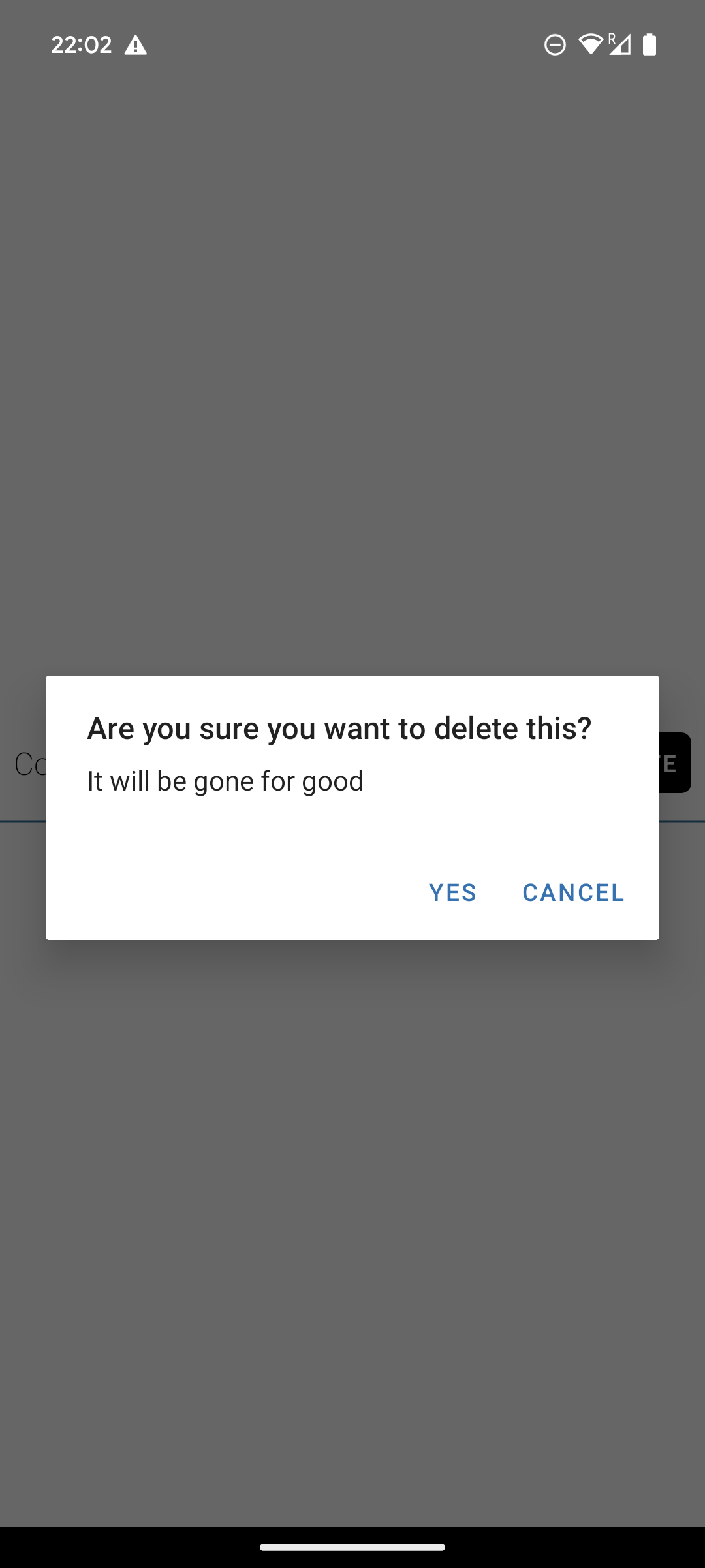
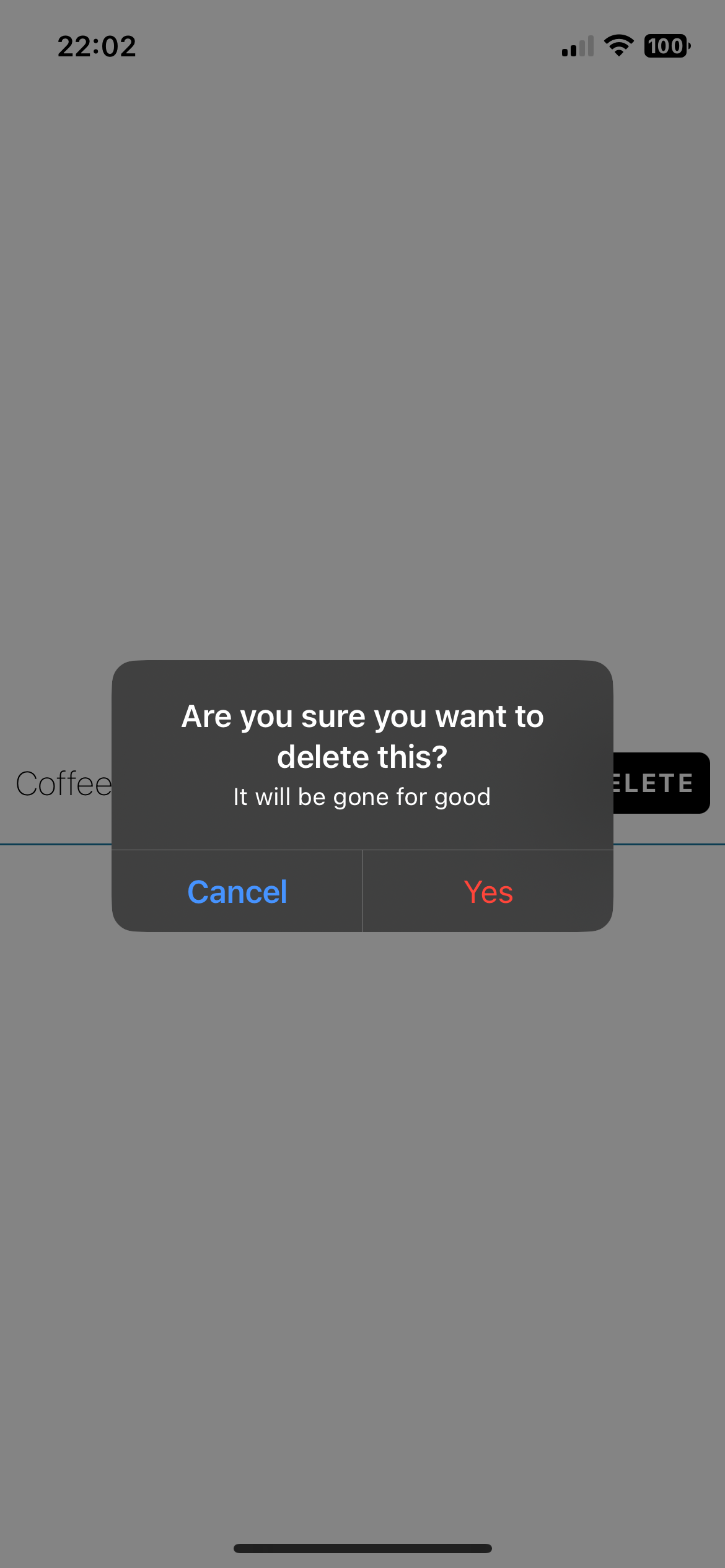
The native Alert is convenient for displaying alerts to the user and asking for confirmation.
Let's ask the user to confirm before we handle the delete action.
Update: App.tsx
-import { StyleSheet, Text, TouchableOpacity, View } from "react-native";
+import { StyleSheet, Text, TouchableOpacity, View, Alert } from "react-native";
 import { theme } from "./theme";

 export default function App() {
+  const handleDelete = () => {
+    Alert.alert(
+      "Are you sure you want to delete this?",
+      "It will be gone for good",
+      [
+        {
+          text: "Yes",
+          onPress: () => console.log("Ok, deleting."),
+          style: "destructive",
+        },
+        { text: "Cancel", style: "cancel" },
+      ],
+    );
+  };
   return (
     <View style={styles.container}>
       <View style={styles.itemContainer}>
         <Text style={styles.itemText}>Coffee</Text>
         <TouchableOpacity
-          onPress={() => console.log("Delete?")}
+          onPress={handleDelete}
           style={styles.button}
           activeOpacity={0.8}
         >
Checkpoint
| Android | iOS |
|---|---|
 |  |
 |  |