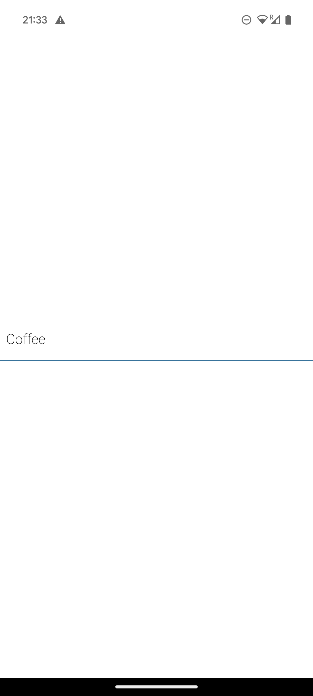
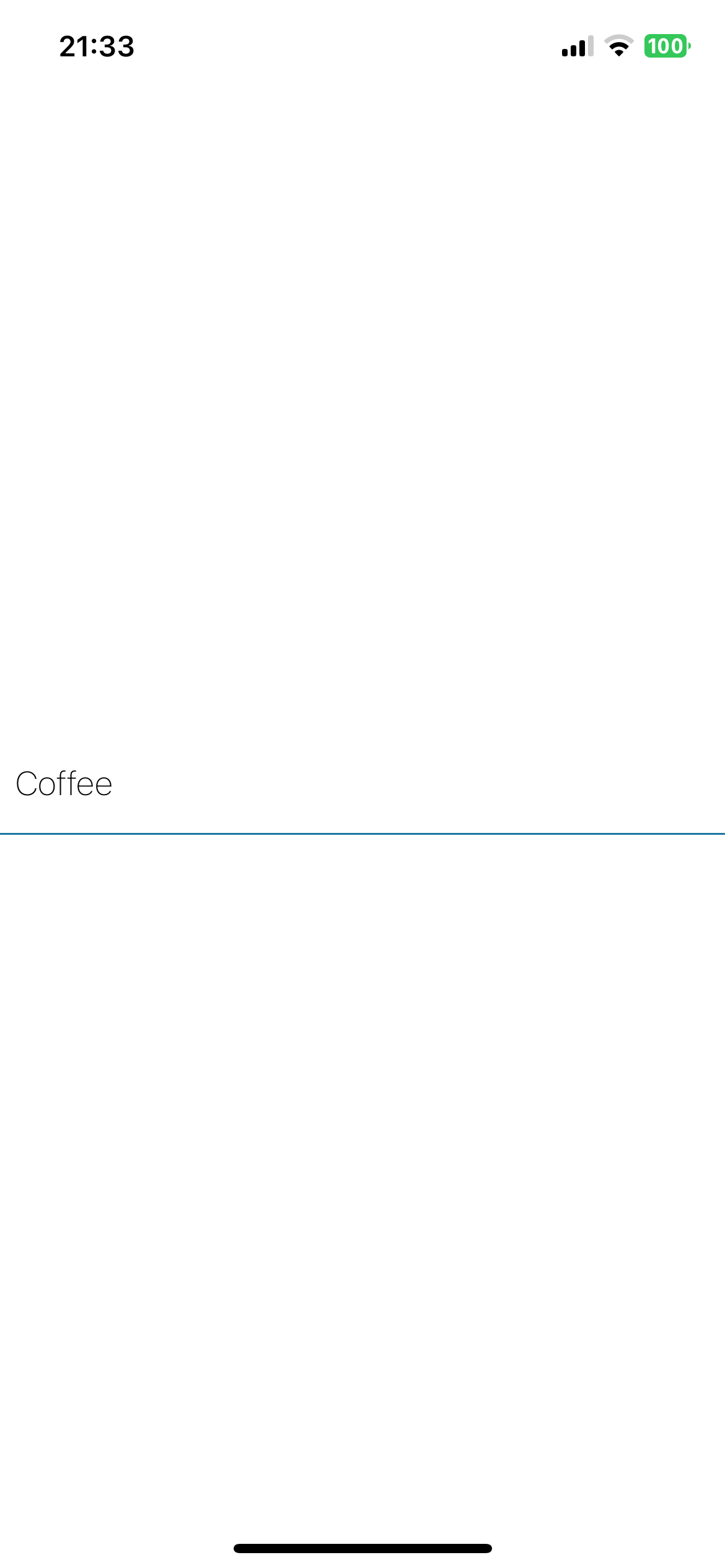
Shopping list item
Let's dive straight in and start writing some code. The first page of our app is going to be a shopping list, so we'll start by building the component for a shopping list item.
We'll need a View, a Text and some inline styles.
View
A View is used almost exactly to how a div is used on the web: for positioning and styling.
Text
The closest equivalent to a Text is a p, but not it's not quite the same. In React Native, all text elements must be wrapped in a Text. Failing to do so will cause your app to crash.
Inline Styles
Styling in native is actually startlingly similar to css on the web. The same style names are used, the same built-in colors exist. The main differences are:
- no units (no px, em or rem, everything is in display points)
- defined as valid JavaScript objects
- no css animations
Positioning in React Native is done with Flexbox. It behaves close to how it does on the web, but with a few differences:
- all elements have
display: flexby default flexDirectiondefaults to tocolumn(instead ofrow)alignContentdefaults toflex-start(instead ofstretch)flexShrinkdefaults to0(instead of1)- the
flexparameter only supports a single number
Create the shopping list item
Now let's add a shopping list item with some padding and a cerulean (#1a759f) line underneath.
Update: App.tsx
-import { StatusBar } from "expo-status-bar";
 import { StyleSheet, Text, View } from "react-native";

 export default function App() {
   return (
     <View style={styles.container}>
-      <Text>Open up App.tsx to start working on your app!</Text>
-      <StatusBar style="auto" />
+      <View
+        style={{
+          paddingVertical: 16,
+          paddingHorizontal: 8,
+          borderBottomColor: "#1a759f",
+          borderBottomWidth: 1,
+        }}
+      >
+        <Text style={{ fontSize: 18, fontWeight: "200" }}>Coffee</Text>
+      </View>
     </View>
   );
 }

const styles = StyleSheet.create({
   container: {
     flex: 1,
     backgroundColor: "#fff",
-    alignItems: "center",
     justifyContent: "center",
   },
 });
Use the StyleSheet
As you can see we can pass in styles directly to our component using the style prop. But the blank template has this StyleSheet.create at the bottom of the file. React Native styling does not have any global styles, so the convention is to have one style object at the bottom of your file. Think CSS modules.
Let's move our styles to the StyleSheet.
Update: App.tsx
import { StyleSheet, Text, View } from "react-native";
 export default function App() {
   return (
     <View style={styles.container}>
-      <View
-        style={{
-          paddingVertical: 16,
-          paddingHorizontal: 8,
-          borderBottomColor: "#1a759f",
-          borderBottomWidth: 1,
-        }}
-      >
-        <Text style={{ fontSize: 18, fontWeight: "200" }}>Coffee</Text>
+      <View style={styles.itemContainer}>
+        <Text style={styles.itemText}>Coffee</Text>
       </View>
     </View>
   );

const styles = StyleSheet.create({
     backgroundColor: "#fff",
     justifyContent: "center",
   },
+  itemContainer: {
+    paddingVertical: 16,
+    paddingHorizontal: 8,
+    borderBottomColor: "#1a759f",
+    borderBottomWidth: 1,
+  },
+  itemText: {
+    fontSize: 18,
+    fontWeight: "200",
+  },
 });
Use a shared theme file
As a last bit of housekeeping, we've defined two hex colors in our file here. Let's pull them out to a theme file. This is a handy pattern to get into as it prevents duplication and you'll be able to experiment with changing the color scheme of your app with a single line of code in the future.
Create a theme.ts file at the root level of your project and move the cerulean and white colors in there.
New file: theme.ts
export const theme = {
  colorCerulean: "#1a759f",
  colorWhite: "#fff",
};
Update: App.tsx
@@ -1,4 +1,5 @@
 import { StyleSheet, Text, View } from "react-native";
+import { theme } from "./theme";

 export default function App() {
   return (
@@ -13,13 +14,13 @@ export default function App() {
 const styles = StyleSheet.create({
   container: {
     flex: 1,
-    backgroundColor: "#fff",
+    backgroundColor: theme.colorWhite,
     justifyContent: "center",
   },
   itemContainer: {
     paddingVertical: 16,
     paddingHorizontal: 8,
-    borderBottomColor: "#1a759f",
+    borderBottomColor: theme.colorCerulean,
     borderBottomWidth: 1,
   },
   itemText: {
Checkpoint
| Android | iOS |
|---|---|
 |  |